Here are three examples of interfaces I have interacted with, or even interact with on a regular basis.
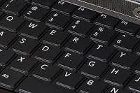
Computer keyboard: The computer keyboard is easily the (digital) interface I spend most time with. I enjoy typing on a nice keyboard with correct key spacing and pleasant tactile and acoustic feedback. Touch screen keyboards, by contrast, lack both. It is interesting to note that today’s keyboards (and their layout) derive directly from the user interface of mechanical typewriters. People have commented on the idiosyncrasies of the various key layouts and experimented with alternative layouts. To me, an even more interesting question is the efficiency of the typing process. Are there alternative methods of letter-based input that use more efficient motion (i.e. less muscle exertion) while providing sensory feedback and allowing for rapid text input?
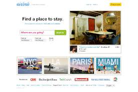
 AirBNB website: I used AirBNB for the first time to find an apartment in Copenhagen for the CIID summer school program. I found the website straightforward to learn, self-explanatory and pleasant to use. The multiple, integrated (digital) communication channels (website / e-mail / phone / text messaging) allowed me to make contact with the landlady in a quick and uncomplicated way that served her needs and mine. To me, the mostly ad-free layout of the website with large, friendly lettering creates an atmosphere of trust.
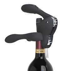
 “Rabbit” corkscrew: My favorite example of analog interaction design is the (mechanical) interface of a high-end corkscrew known as “the rabbit”. It turns the sometimes messy process of getting the cork out of a wine bottle into an enjoyable user experience. Surface texture, weight of the tool, and its smooth movements all add to the feel of a well-designed piece of equipment. At the same time the shape of the tool is entirely self-explanatory, requiring no instruction manual. Even the task of removing the metal wrapper has been re-designed with a simple, ergonomic add-on to the rabbit.

